
When I’m not preoccupied with deadlines, the topic of brochure design can transport me back to a time when printed collateral was more prevalent.
That’s right, kids. The ’90s!
(Do you miss them?)
It’s not like print is entirely dead, though. We certainly still handle a decent amount of brochure design work.
 Now, granted, many brochure design projects adhere to a standard page size format that can be compressed as a PDF, attached to emails, and output on personal print devices.
But you never know when an interesting brochure design project might pop up. So, here’s a step-by-step to help get you through your next one safely.*
Smooth out your next brochure design project with these practical ideas:
1. Zero-in On Your Purpose
Yes, that’s super-basic advice for any marketing piece. But a key difference between online and print is that you’re committing to a final version that will roll on a press. Trust me, you don’t ever want to find a mistake on printed collateral that you are responsible for.
 So, let purpose be your mantra every step of the way. What message must you get across to the audience who will put their hands on this brochure? What action do you want them to take? From planning through to final delivery, every brochure design step must consider the ultimate purpose.
“Since a brochure is a communication tool, it’s important that you know your target market.” —Igor Ovsyannykov, Creative Market
2. Constrain and Refine the Copy
 On the web, we have more room to make our case.
On a designed, folded sheet of paper? Not so much.
Text-wise, your brochure will feature titles, marketing copy, product copy, legal disclaimers, captions, and product specs. Copy fills space rather quickly, and key stakeholders will always want to add more words before you’re finished. You can’t just keep reducing type size! There’s only so small you can go before it’s not legible.
“Great copy is often the most undervalued element in brochure design. A lot of people don’t understand that copy needs to be considered as part of the overall design concept.” —Creative Bloq
Less copy affords more freedom for your designs. So, work with your copywriter to slim down copy as much as possible.
 3. Establish a Hierarchy for the Main Ideas
Most people scan brochures before they read them. They are looking for the most relevant, interesting, or helpful information they need to make a decision.
Use contrasting type sizes to reinforce the hierarchy of ideas in your design. Headlines and subheads should be noticeably larger than product copy or legal disclaimers.
“A professionally designed brochure can be an important lead-nurturing marketing strategy.” —Igor Ovsyannykov, Creative Market
4. Consider Your Format Options
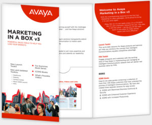 A brochure design that features embossing, special inks, interesting folds, or die-cuts can help you break through the clutter. Brochures like this one at right can be fun to produce because the planning goes way beyond a simple two-sided flyer.
In fact, a quick story about another recent brochure design provides a great example:
Mini-Case Study: Where’s the “Wow?”
A client wanted to generate a brochure to showcase Canon USA’s entire line of large format printers. She sent us a few interesting brochures she’d collected and emphasized that they wanted to create something unique. A brochure design that would carry a “wow factor.” She wanted it to be something that sales reps and customers alike would take notice of.
I examined the samples she’d sent, but quickly realized the formats would go beyond the client’s budget parameters.
Soon enough, I had a brainstorm. “What if the brochure design could be draped across a wide sheet of paper and folded down, accordion style?” Not only would our client score a win on the uniqueness factor, it would also make a ton of sense for the sales reps, and would work with their print budget.

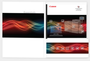
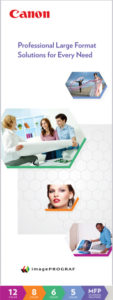
This brochure folded out on wide sheets that cleverly reinforced Canon’s large format printers.
Long story short, the final result was a light brochure design that communicated a ton of technical information. It folded out on wide sheets of paper that cleverly reinforced their large format printers. Talk about fulfilling a client brief!
“Brochures don’t have to be folded booklets bound at the center. They can stretch out in a variety of different ways.” —Caitlin Jordan, Canva
The point is, going beyond conventional formats doesn’t have to be cost-prohibitive. There might be a way to create something quite interesting that isn’t necessarily expensive.
 5. Choose an Appropriate Paper Stock
Does your approach call for matte finish or glossy paper? Does the brochure design require standard bright white stock — or a custom color?
Different brochure designs require varying amounts of ink coverage. Dark inks have a tendency to show through paper that isn’t thick or opaque enough. So, become familiar with paper weight (thickness) and know the difference between text and cover stock.
6. Collaborate with Your Printer
 Speaking of options like paper, I recommend collaborating with your print representative from the very start of the process. Even if you’re not sure what the quantity or final size of your brochure design will be, your printer can help you avoid pitfalls and budget surprises.
Once you finalize the idea and quantities for your brochure design, your print rep can get you realistic budget numbers and a production schedule.
 7. Generate Design Concepts Based on Research
Optimal brochure design will usually convey the client’s core business values and establish the tone — whether lighthearted or serious.
In any case, it’s useful to generate design concepts as a foundation for exploration. Free-associate a bit. Generate a list of words, letters, and shapes that might be related to the product’s main challenges and/or solutions.
8. Research Complementary Photos and Illustrations
You’ve only heard the phrase, “a picture’s worth a thousand words” about a hundred times or so. Well, use that to your advantage. If your brochure design calls for custom photos, illustrations, or product shots, coordinate with your client to obtain those. If stock imagery is required, find images that support your theme, tone, and goals.
 “A stunning photo or illustration grabs attention, creates a mood, and supports your story. This image is your “focal point” and will draw your readers in.” —Karen Saunders, Business Know-How
When researching online stock photo libraries, the keywords associated with your project should serve you well. I also recommend widening and narrowing the scope of your searches. Perhaps there’s an item within a photo (like say, “mobile device” for example) that will help convey your meaning efficiently. Then, that’s the term you want to search on rather than the keyword.
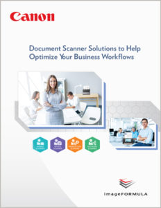
Click on the brochure at right to enlarge. We found photos with open desk areas that allowed us to place actual products within the scene.
9. Execute Layouts that Obey Design Rules
Graphic design is a topic larger than we have space for in this post. Educated, experienced designers can skip right past this advice. But, allow me to reinforce some basics:
 Establish a grid system and observe the rule of thirds. Keep the four most important aspects of brochure design in mind; contrast, repetition, alignment, and proximity.
Remember that information graphics can help you convey vast information in a small amount of space. And workflow diagrams can help you explain processes more efficiently.
10. Select Typefaces Judiciously
Any time you read this, there will be more typeface choices available than ever before. Frankly, typeface options can become bewildering if you let them.
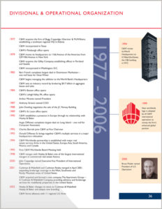 So, narrow down the set of typefaces you rely on. Certainly adhere to your client’s brand guidelines when selecting type. But if you’re free to select type on your own, make sure it helps reinforce the tone you want to get across in your brochure design.
Carefully set type with appropriate line spacing and consistent paragraph spacing. Limit yourself to two – perhaps three typefaces at most within one brochure design.
Be wary of typefaces that feature thin lines or details. Type that’s too small or delicate can result in ink dropouts.
 11. Choose Colors that Reinforce Branding and Purpose
Establish a limited palette of complementary colors that serve your purpose. Ensure that colors for your client’s logo meet their brand guidelines and avoid repeating those logo colors elsewhere unless sanctioned by your client.
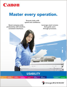
Use colors to establish order or distinguish between “categories.” Take a closer look at the large format printer brochure here and above. We used a different color for each printer class. Purposeful use of color helps your customers find what they need faster.
 12. Include Plenty of White Space
The empty space throughout your brochure design serves as a design element. White space provides a contrast to design elements and type. Margins are a good example. They allow room for our fingers to hold a brochure and flip pages through a booklet.
Establish consistent areas of white space above subheads, below paragraphs, and around objects to guide customers to what’s most important. Don’t allow subheads to float way above paragraphs which they “belong to.” I’ve noticed a troubling trend in that regard, lately.
 13. Arrange Elements for Easy Scanning
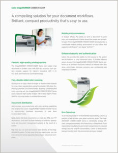
Don’t allow headlines or photos from different columns of text to sit right next to each other. The result is called “tombstoning,” an effect where both elements lose focus.
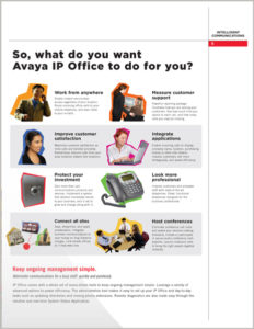
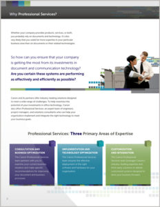
Click on the example at left to enlarge. See how the main images in each column sit at different heights?
Quotes and testimonials can breathe life into copy, so consider adding pull quotes to a brochure design where appropriate. Break headlines and subheads at logical pauses and use tab-setting controls to align items in tables.
14. Remove to Improve
 Now, scan your brochure design to see if anything can be removed or constrained. As mentioned, generous white space will be an asset.
Any visual element that serves little practical purpose to communication should be reconsidered.
 15. End With a Call-to-Action
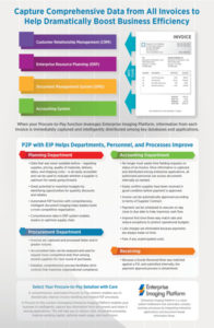
Writing a persuasive Call-to-Action (CTA) is a fascinating topic. Think about what motivates a person to engage further with a brochure design or order a product?
“However well-designed your brochure is, if it doesn’t include a call-to-action, it won’t serve its true purpose.” —Igor Ovsyannykov, Creative Market
It’s a large topic that we can spend more time on soon. Just remember to ask your audience for an action. If it was worth investing budget on the brochure, surely it’s worth asking your reader to take a specific action.
16. Apply Professional Proofreading
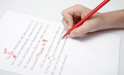 Perform a spell-check, review the copy line-by-line, and run the text through a tool like Grammarly. If your client has a legal department, make sure they have a chance to review the final copy as well.
After you flow all copy into your brochure design, have the final version proofed by a professional. The cost for proofing is generally modest and well worth the investment. Our proofreaders always find details that we might otherwise have missed.
 17. Scrutinize Proofs and Test Sheets at Press Checks
Virtually all printers generate client proofs as a standard part of the print production process. It enables both printer and client to agree on what the final result should look like.
Normally, printers will output color proofs and perhaps a “dummy” to demonstrate how the final brochure design would be trimmed and folded. You, as the client, would mark any discrepancies you are concerned about or approve with your signature and date.
If you’re near enough to your printer, I also recommend doing a press check in-person. Scrutinize the first prints as they come off the press, and make sure they match the digital proof you approved. You can also make sure skin tones and contrasts look true to life. Pay careful attention to the client’s logo and product images as well.
Phew! Is that enough advice for you?
Good luck with your next brochure design!
*A quick word for project managers: We definitely recommend working with a professional designer who has print production experience. Adobe tools like Photoshop, Illustrator, and InDesign are a lot more foolproof than they once were. However, errors can end up costing you a lot of money on reprints. Especially when you don’t have a working knowledge of the print process.
Get Your Free Business Writing eBook Now
Need to move forward on a difficult writing project? This practical guide will help you get started. Send a link directly to my inbox:
Sources may include:
How to Make a Business Flyer that Gets Results, The New Business Idea
Brochure design: 10 Top Creative Tips, Creative Bloq
10 Easy Ways to Make Your Flyer Stand Out of the Crowd, Karen Saunders, Business Know-How
The Non-Designer’s Design Book , Robin Williams
Roger C. Parker’s One-Minute Designer, Roger C. Parker
How to Design a Stunning Brochure: 30 Expert Tips and Templates, Igor Ovsyannykov, Creative Market


