Get to Know The Designers Republic and Ian Anderson

[spacer height=”10px”]
Like many of you, I’d gamble, my interest in graphic design sprung from a slight obsession with music. I often found the details on those record sleeves enhanced the listening experience.
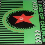
Do you remember “Kiss” by Age of Chance?
In the 80s, vinyl began falling out of favor though. Based on the success of the Sony Walkman, cassettes gained momentum for a few years. But by the early 90s, compact discs began to dominate retail. The canvas for these great artworks had begun to shrink.
Yet, the packaging of our favorite music still meant something, didn’t it? I was interested in a lot of British acts. So, designers that made a big impact on me back then were Vaughan Oliver/23 Envelope for 4AD records and Peter Saville for Factory. The caliber of work these two studios routinely delivered would encourage fans to take a chance on titles they may not have even heard.
Soon, The Designers Republic started becoming a force in a similar way. In fact, it was all going pretty great for them until they had to abruptly shut down their offices.
But there’s much more to the tale than that. So, I thought I’d share their story and samples with you.
[spacer height=”10px”]

Here’s looking at you, Ian.
Founder of the Republic
It starts with Ian Anderson, a man who discovered his capacity for design somewhat accidentally. A Sheffield band he’d started managing needed flyers, so he simply took on the task like any other.
But the exercise turned into an “Aha” moment for him — and soon enough he’d joined forces with artist/musician Nick Phillips to establish a graphic design studio.
“I thought I would be a famous band manager, but I didn’t like managing others’ creativity. I was more interested in my own.” – Ian Anderson, interview in Made North
Record sleeves for a Leeds band called Age of Chance and Pop Will Eat Itself drew increased attention to their work during the late 80s. “It was entirely consistent with their buccaneering methods that tDR acted almost from the start as though they were an established brand – a pop culture myth.” —Rick Poynor, Creative Review, 2009
[spacer height=”10px”]

Angryman, The Designers Republic
A Unique Style
Though their design style does have some range, there was a focus on simple shapes, bright colors, and sharp contrasts at first.
The work was generally playful, subversive, and ironic. Some of the characters they created seemed like geometric versions of manga and animé figures.
“At the heart of this vision was their conception of an imaginary Japan. Anderson didn’t visit the country until 1998 and from the outside it seemed to represent the most advanced, extreme, and intoxicating form of consumer capitalism on the planet.” —Rick Poynor, Creative Review, 2009
[spacer height=”10px”]
Video Games
Now, I’ve never really been what you could call a “gamer.” I’d hop on a friend’s system to unwind and be social. But video games never hooked me for any length of time.
Until Wipeout came along in the mid 90s, that is.
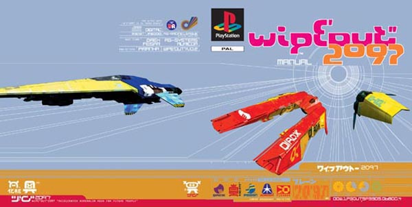
Wipeout XL (2097) game cover art, 1996
[spacer height=”10px”]
Wipeout XL was essentially a racing game. You steer a futuristic ship along a track – fighting competitors along the way – in order to win medals and advance to more difficult competitions.
It was fast-paced, yet the controls were somewhat forgiving. It wasn’t overly difficult for non-gamers like me — at least at first. The game also incorporated a brisk soundtrack of electronic artists and stunning visual design that immerses you in the action.
Those visuals, both on the packaging and the game itself, were largely developed by The Designers Republic. “In their era-defining work for Sony’s Wipeout PlayStation games, in the mid to late 1990s, they achieved probably their biggest international audience and their graphic imagery was even applied within the games, producing a seamless relationship between packaging and content.” —Rick Poynor, Creative Review, 2009
[spacer height=”10px”]
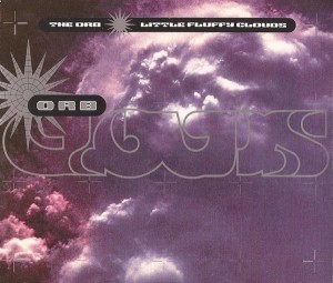
The Orb, “Little Fluffy Clouds” cd sleeve art, 1990
Put Another Record On
Meanwhile, The Designers Republic had also been working with another British electronic music label called WARP. In fact, Anderson designed the logo and helped establish the iconic purple 12” sleeves that the WARP identity would become heavily associated with.
As such, The Designers Republic began forging collaborations with some key artists on the label, including Aphex Twin, Autechre, and The Orb.
Asked to outline the elements of a good record cover, Anderson has said, “It has to both compliment the product and expand the consumer experience. The artwork should engage, on whatever level, from the listener’s experience throughout duration of the album, or by repeated exposure.” —Interview with Ian Anderson for 200%
“By the end of the 1990s, tDR’s designs had left the cartoon jokiness and warmth of their early work behind and become increasingly austere, with a greater emphasis on photography.” —Rick Poynor, Creative Review, 2009
[spacer height=”10px”]
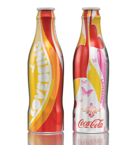
Coca-Cola limited bottle designs, 2006
Fizzy Lifting
From the late 90s into the 2000s The Designers Republic continued to grow and evolve. Headcount increased and they took on larger clients.
“When Coca Cola originally approached TDR™ part of me thought ‘no,’ instinctively.” But meeting with folks on the client team seemed to energize and challenge him.
“[It] seemed to be something worth doing because the other option is to sit in your own little niche, at your usual table with your usual mates in your usual pub in your small self-satisfying self-obsessed little world and moan about everything but never do anything.” —Ian Anderson, from profile on Leeds College of Art
[spacer height=”10px”]
[GDC_row]
[GDC_column size=”half”]

[/GDC_column]
[GDC_column size=”half”]
[spacer height=”20px”]
On the Three Words that Drive Website Traffic & Leads:
“Business people need Magnetic Content to attract and engage.” —James Fortier
[/GDC_column]
[/GDC_row]
[spacer height=“5px”]
Hard Times
Not unlike hundreds of other businesses worldwide at the time, The Designers Republic suddenly had to close down their office and lay off staff in January, 2009.
“… the studio became insolvent due to a combination of factors. We’d lost a couple of clients, didn’t win a couple of pitches, got a tax bill which should have been sorted out and wasn’t and a major client who didn’t pay the money they owed us. In themselves any of those things would have been fine but when they come all at once there’s not much you can do.” —Ian Anderson, interview in Creative Review
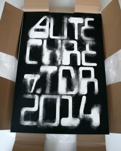
“Autechre v. TDR 2014” screenprints in box, 2014
The agency’s closure hit staff – and indeed the design community – hard at the time. But Anderson realized it had just gotten too large. Not long after that, he regrouped and reinvented The Designers Republic as a smaller studio with a narrower focus.
“One of the things we’re doing is returning to a working process where we’re funneling our creativity into commercial clients which always used to benefit the clients – the right kind of clients.”
“The right kind of client is anyone who will say we can see the value of working with you let’s celebrate what you do and help you do it for our benefit. That takes a certain kind of person and client.” – Ian Anderson, interview in Made North
For a more in-depth look at work created by The Designers Republic, I’ve created a separate post, More Artwork from The Designers Republic. Take a look!
Get Your Free Business Writing eBook Now
Need to move forward on a difficult writing project? This practical guide will help you get started. Send a link directly to my inbox:
[hubspot type=”form” portal=”23678610″ id=”baed7097-2823-49af-8fa0-3a16aafe849f”]
Sources may include:
Ian Anderson, The Designers Republic, Made North
The Designers Republic Is Dead; Long Live The Designers Republic
Brain Aided Dancing, Damon Fairclough, Noise Heat Power
They Sell! We buy!, Rick Poynor, Creative Review
The Designers Republic is Dead, I Love Graphics
200% Meets Ian Anderson
We Catch Up with Ian Anderson from the Designers Republic
Up Over Down Under with tDR
Interview with Ian Anderson Founder of The Designers Republic
The Designers Republic, Wikipedia
The Making of Wipeout, Damien McFerran, PushSquare
The Designers Republic Remembered, Creative Review
Aphex Twin’s Syro Gear List … Or Is It?

