
Google just made an important change to its search algorithm — it will start favoring mobile responsive websites over sites that aren’t.
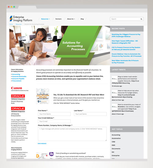
Responsive Campaign Site for Canon Information & Imaging Solutions
That’s a big deal — especially for small- to medium-size companies that may not have had a chance to update their site over the past couple years.
Also, how easy is your website to use? Can visitors find what they want quickly? Does functionality encourage people to explore in a purposeful manner?
These are all questions of how well the design has been engineered. User experience design involves planning, research, design, and testing to maximize the experience for the widest range of users.
But in recent years, responsive design for mobile devices has become a whole additional layer to consider when planning user experience design. When your site is properly designed to display on mobile devices it will provide a better experience for a wider range of users. For consumer brands, it can also simplify the sales process for their customers.

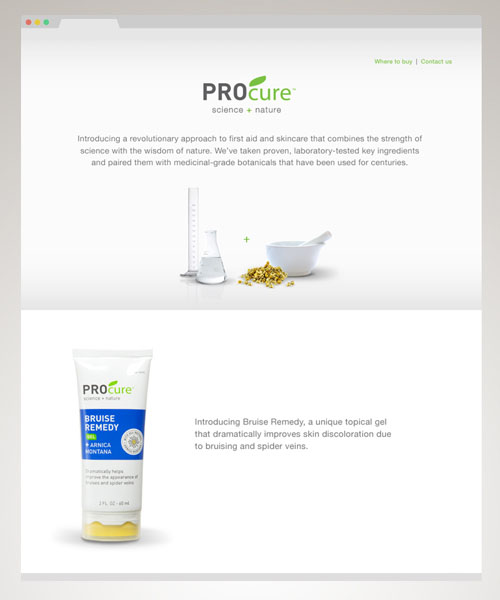
Mobile Responsive product site for PROfoot consumer brand
A few more useful quotes and stats:
“Google has clearly indicated that it prefers responsive designs to the mobile templates.” —TechCo
“About 60% of online traffic now comes from mobile and Google wants users to have a good experience whenever they click on a mobile link.” —Business Insider, 2015
“According to a study conducted by the Aberdeen Group, websites featuring a responsive design were rewarded with a 10.9 percent increase in visitor to buyer conversion rates year-over-year.” —Inc Magazine

The Spark Creative team has great experience implementing the technology that should underpin your website, helping it to “fold down” to the size of your mobile device’s screen in an elegant and useful manner.
In fact, the Spark Creative team’s 20+ years of experience creating video, interactive, and website projects gives us a unique perspective on user experience design and responsive design for mobile that will result in online assets that make a difference for your business.
Talk to us about how you want to leverage responsive web design.

Get Your Free Business Writing eBook Now
Need to move forward on a difficult writing project? This practical guide will help you get started. Send a link directly to my inbox:
Sources may include:
Google is making a giant change this week that could crush millions of small businesses,” Business Insider
Top 5 Reasons to Use Responsive Website Design, Ajit Nayak, TechCo
Why Responsive Web Design Helps People Buy Your Product, John Boitnott, Inc. Magazine